

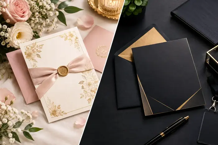
Wedding Vs Corporate Event Invitations: Choosing The Right Design
An invitation is not just meant to announce a date. It can give guests their first glimpse of what the event will feel like, whether that means an intimate wedding dinner or a high-profile corporate reception. This is where, if you choose the wrong design, it can create problems: a wedding invitation that will feel too corporate may lose its warmth, and a business invitation that is overloaded with decorative details can weaken professionalism.
The right choice can come down to purpose, tone, audience, information and the experience that you want guests to expect. In this blog, you will walk through the differences between both and steps to choose the right design.
What Makes Wedding And Corporate Invitations Different?
The biggest difference between both of them is emotional intent. A wedding invitation is often personal and expressive, and a corporate invitation needs to communicate purpose and credibility quickly. Both of these invites need attractive design, but they speak to very different audiences. Wedding stationery can traditionally give considerable attention to hosts, ceremony details, names and formal wording.
Corporate invitations do a very different job. A guest should understand who is hosting, when and where it happens, what the event is for, what to wear and how to respond without hunting through paragraphs of copy. Current corporate invitation guidance has emphasized clarity, RSVP information, event purpose and useful logistics. This difference should influence everything from typography and colour to paper stock and wording.
Steps To Choose The Right Invitation Design
You should start a good design process before you choose a font or browse templates. Think of the event as an experience first, then let the invitation visually support it. The following steps will make the decision much easier.
1. Define The Personality Of The Event
You should ask yourself what guests should feel when they first see the invitation. A wedding may aim for romantic, modern, relaxed, traditional, cultural or luxurious. A corporate event invite could feel authoritative, celebratory, innovative, exclusive or approachable.
For example, a garden wedding can use botanical illustrations and muted greens and an executive awards dinner can benefit from restrained typography and a dark, sophisticated palette. The design that you choose should make sense before anyone reads the details.
Who is receiving the invitation? This question can help you completely change your design decision. Wedding guests can include parents, close friends, colleagues, relatives and family friends, so personal touches can help you make the invitation feel meaningful. Corporate audiences can include clients, employees, media representatives, investors, partners or senior executives.
They generally need information that is presented faster and with less visual distraction. You should think of the invitation almost like a first handshake. A carefully designed custom business cards can communicate an identity of a company in seconds and a corporate invitation should do the same and also giving guests the information they need.
3. Match Typography To The Occasion
Typography can quietly establish formality. Elegant serif fonts, refined scripts and carefully spaced lettering can work perfectly for weddings, especially when the celebration has a classic or formal character.
Corporate invitations usually benefit from cleaner typefaces. A strong sans serif that is paired with one complementary display font can help you create hierarchy without making the page feel busy. You should not sacrifice readability for personality. If guests need to squint to find the venue or RSVP deadline, the design has missed its practical purpose.
4. Choose Colours With Intention
One of the fastest ways to communicate the mood of the event is its colour. You can highly personalize wedding palettes. Shades including Ivory, blush, burgundy, metallic gold, champagne, sage, navy or culturally significant colours may all work according to the celebration. Personalization remains especially important, with about eight in ten respondents saying that it was extremely crucial for their wedding to feel personal to their partnership.
You should generally align your corporate invitations with brand colours without turning the invitation into an advertisement. If a company is using blue and white across its identity, those colours can appear through borders, logos, headings or subtle accents instead of covering the entire design. The same principle is applied to premium identity materials like luxury metal cards in Canada: sophistication usually comes from controlled use of colour and finish instead of adding each available visual effect.
5. Select The Right Paper And Finish
Material can help you change perception. The use of a thick textured stock can make a wedding invitation feel substantial, but foil, deckled edges, embossing or speciality envelopes can reinforce a luxurious theme.
Premium stock can also be effective for corporate events, especially for executive dinners, award ceremonies, product launches and investor events. A heavily embellished invitation will be suitable for a wedding, but it can feel excessive for a business conference. Digital invitations need to have the same attention. Animation, clickable maps, responsive layouts and online RSVP forms can be useful for corporate audiences who will manage busy calendars.
6. Keep The Information Hierarchy Clear
Even a beautiful invitation still needs to answer basic questions quickly. Guests generally need the names, date, time, event type, venue, reception information and RSVP instructions for weddings. Formal wedding etiquette can traditionally give these details a deliberate order.
When it comes to corporate invitations, they should make the event name and purpose immediately visible. Then it comes to the date, time, dress code, venue, RSVP method and any information that will affect attendance. If any of the guests need parking instructions, security requirements, dietary-response details or a registration link, you should include them where they are easy to find instead of squeezing everything onto the main card.
7. Make The Wording Fit The Design
Design and wording of your invitation should behave like one system. You can use traditional third-person wording for a formal wedding, and prefer a warmer and more conversational sound for a casual wedding. Your corporate invitations should be polished, but they do not have to sound stiff. A product launch, networking evening and annual awards ceremony can each have a different voice.
It is best to work with an experienced invitation card printing service for printed pieces to help ensure that colours, trimming, typography and finishing translate accurately from the digital design to the finished card.
8. Test Before You Print Or Send
You should never approve an invitation simply because it looks good on your screen. Try to print a physical proof whenever it is possible. Must check names, dates, times, addresses, URLs, phone numbers and RSVP instructions. It is ideal to read the design from a normal viewing distance. You can ask someone unfamiliar with the event to look at your invitation and explain what they think the invitation is saying.
You should test the experience for digital invitations on both desktop and mobile devices. Ensure that links are working, forms load properly, and important details do not disappear on a smaller screen.
Timing can affect how useful an invitation will feel. Wedding invitations can traditionally go out well before the celebration as guests may need to arrange travel, clothing, accommodation and schedules.
Corporate invitations often need to have a different rhythm. Research found that 53% of event organizers began email promotion one to three months before their event, and the ideal window varies by the type of event and audience. Large conferences and executive gatherings may require much earlier notice, but a small internal gathering may not.
10. Let The Event Set The Final Direction
When you are considering two designs, both look attractive, choose the one that can feel most consistent with the actual event. A black-tie wedding should not look like a casual brunch invitation. A startup networking evening does not necessarily need the visual weight of an awards gala. The invitation should not be an exaggerated one, but should create an accurate expectation.
This is ultimately the difference between decoration and design. Decoration can make something look attractive, and good design can make the invitation feel right.
Frequently Asked Questions
1. Should I include the company logo in a corporate invitation?
Yes, but moderation is most important in a corporate invitation. The logo should build ownership and reinforce brand recognition without overpowering the event details. A small and well-positioned logo often looks more sophisticated than a large promotional treatment for formal dinners or executive gatherings.
2. How early should I send wedding invitations?
A practical timeframe to send wedding invitations depends on the event and whether guests are travelling. Couples should allow enough time for guests to arrange their accommodation, attire, transportation and schedules. Destination weddings generally need more advance notice than local celebrations.
3. What information should we never hide in a corporate invitation?
You should enable the guests to locate the event name, host, date, start time, purpose, venue, dress code when relevant and RSVP instructions quickly. If registration, security, parking or access requirements are crucial, you should prominently include those details also.
Final Thoughts
Both wedding and corporate invitations may share the same basic purpose, but the priorities of their design are very different. Weddings usually benefit from personality, emotion and meaningful visual details, and corporate events need clarity, professionalism and strong brand alignment. All of the elements, including paper, color, typography, information hierarchy, wording and timing, support that distinction. It is most important that design sets an honest expectation for the event itself. When every element works together, the invitation will become more than an announcement and it becomes the beginning of the guest experience.

Ethan McAllister is a branding enthusiast and print specialist at LuxeBusinessCards.ca, a platform where creativity blends with craftsmanship. He closely follows design trends across Toronto, Vancouver, and other thriving Canadian markets, helping professionals strengthen their brand identity through refined stationery. Through his blogs, Ethan shares expert advice on choosing the right finishes, textures, and layouts so readers can confidently invest in business cards that leave a lasting impression.